The local Sav-on Drugs near me closes in a few days. It used to be in the same store as a Ralphs (Ralphs was one side, and the other side Sav-On, only the checkout stands seperated the stores).
Today, looking in, they removed one of the wood panels covering the old Ralphs (which closed around 1997) and up on the walls is the old Black Decor that has the big pictures. Ghastly looking but so 80's.
Anyone remember this. They used it around the time they opened Giant.
Old Ralphs interiors.
Moderator: Groceteria
-
runchadrun

- Veteran
- Posts: 618
- Joined: 27 Dec 2005 14:29
- Location: Granada Hills (Los Angeles), CA
- Contact:

-
hypernick1980
- Member
- Posts: 8
- Joined: 09 Jan 2006 05:59
- Location: Ogden, Utah, United States
- Contact:
-
danielh_512
- Veteran
- Posts: 132
- Joined: 28 Dec 2005 01:33
- Location: Cleveland
- Contact:
I would assume that Kroger with their divisions has been as diligent in removing signs of old interiors as they have in their namesake divisions.
Almost all stores have the same interior here, and that is an interior that dates to about 2000, featuring green, white, and a beige color. Aisle signage is black w/a green triangle, and a chalkboard-type look to what is on the aisles. Green and white signage is throughout the store to designate areas, as well as large murals w/gold script writing.
This has been replaced by a new interior in a few stores that is reminiscent of Ralphs interiors. A modern, recently remodeled Ralphs is looking a lot like Kroger remodels.
In the early 90's, Kroger was using a very odd interior, commonly called the "grid interior", as flooring, as well as the walls, featured a pink, mauve, and red grid with script lettering. Remembering Retail (my site) has pictures of this very interior from an abandoned store. The only living Kroger I've been to that still has this interior is one in Elkins, WV, and it was left even though the exterior was slightly remodeled in 2002, but still has many of the elements of the superstore it opened as.
-
storewanderer

- Veteran
- Posts: 571
- Joined: 07 Nov 2005 03:24
- Location: Western United States
- Contact:
Not sure about Ralphs in SoCal. I think they have a mixed bag of interiors there from the late 90's Ralphs, to the mid 2000 and on Ralphs, to Fresh Fare, to old Hughes interiors. Hopefully they've gotten rid of all the old Alpha Beta and Boys interiors.
Smiths has a mixed bag of interiors and doesn't seem to remodel stores much from what I've seen of them.
Frys also has a mixed bag of interiors. Virtually every location I went into looked different. Quite a few did have the late 1990's Smiths interior (black wall lettering) which I thought looked decent (for Smiths).
Fred Meyer seems to remodel stores every 10-15 years and has kept things modern, but not made every store look the same.
So from my viewpoint (keep in mind I am in a Smiths market), nothing is being done to remove signs of old interiors.
-
Groceteria

- Great Pumpkin
- Posts: 1938
- Joined: 04 Nov 2005 12:13
- Location: In the breakroom
- Contact:
I find the Smith's layouts (if not the interior design) to be more reminiscent of Kroger than those of any of the other siblings. I haven't ever been in a Dillon's, though. They might be more Kroger-esque, since they've been in the family longer.storewanderer wrote:Smiths has a mixed bag of interiors and doesn't seem to remodel stores much from what I've seen of them.
And some of the newly-remodeled Krogers I saw in Ohio a few weeks back looked VERY much like Ralphs stores. They seem to be using this look more in retrofits than in new stores.
storewanderer wrote:Frys also has a mixed bag of interiors. Virtually every location I went into looked different. Quite a few did have the late 1990's Smiths interior (black wall lettering) which I thought looked decent (for Smiths).
The ex-Smith's Fry's store pretty much use the exising Smith's designs w/a few signage changes, while the ex-Fred Meyer/Smitty's Marketplace stores use the SW style decor that they had before being rebranded. Fry's is also copying Kroger designs on a few stores - blackboard style aisle signs and unpainted(but clear coated) concrete floors. I went into a Kroger in Ft Worth with the same decor.

storewanderer wrote:Hopefully they've gotten rid of all the old Alpha Beta and Boys interiors.
lol...the Ralphs on vernon and Fig in south LA still has the Boys interior...well it did....it closed bout 3 weeks ago....the Boys interiors were so simple....i wouldnt even call it a prototype
Pavilions, the new, the unusal, the BEST of everything!
-
storewanderer
- Veteran
- Posts: 571
- Joined: 07 Nov 2005 03:24
- Location: Western United States
- Contact:
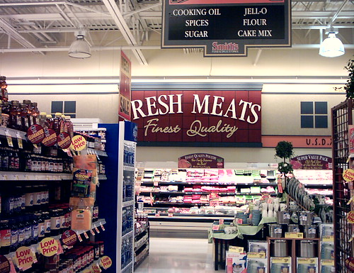
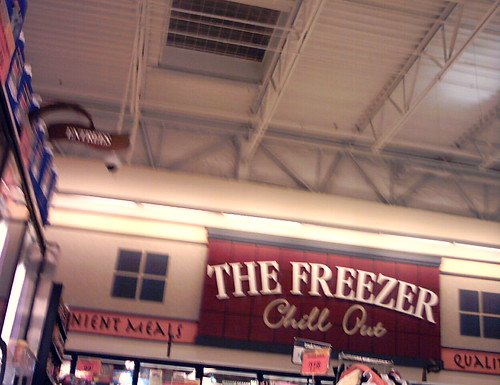
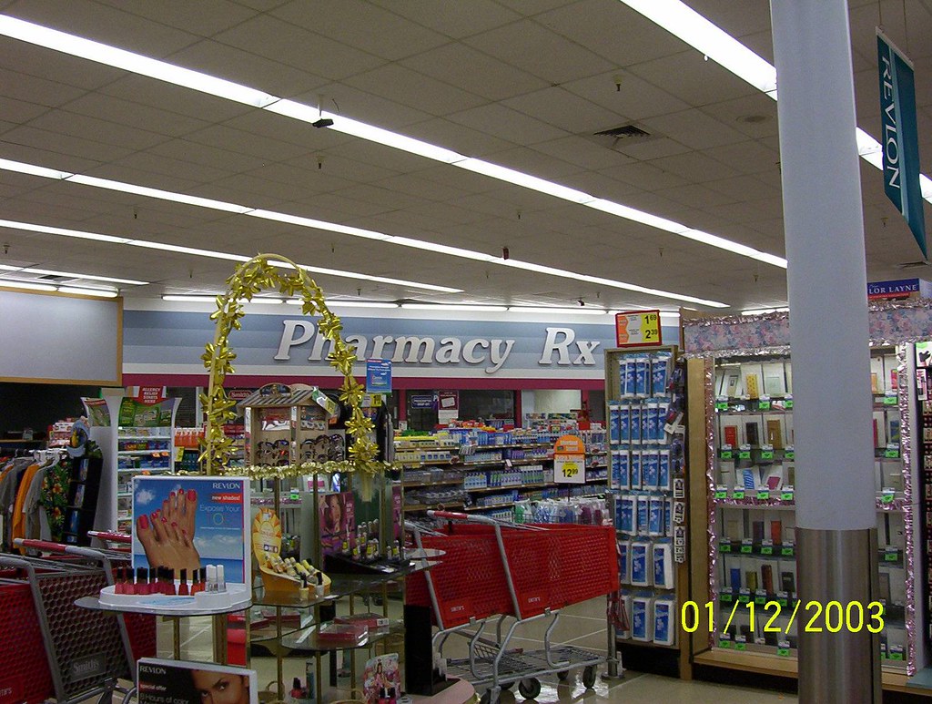
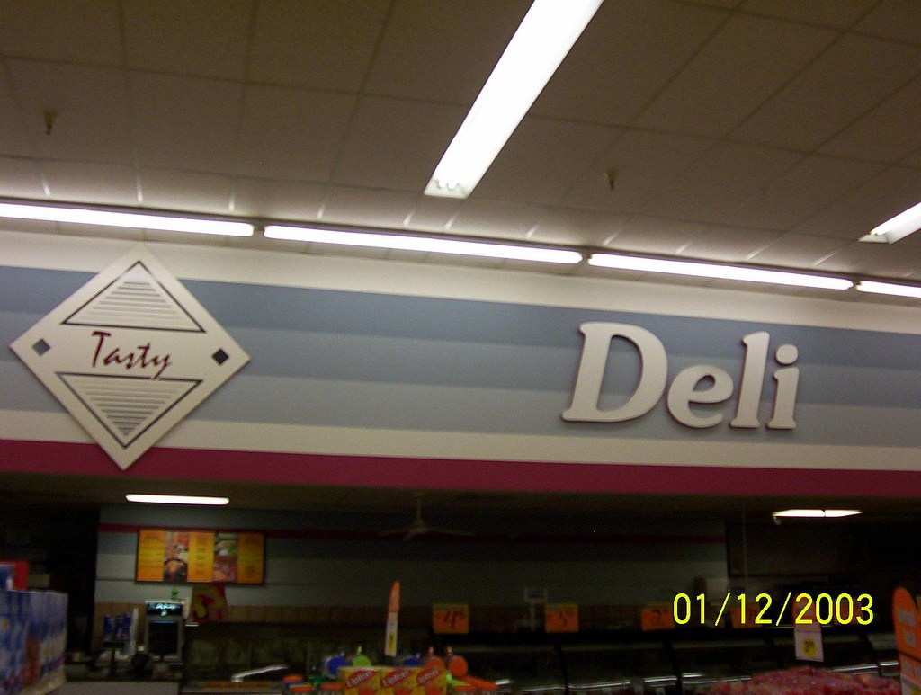
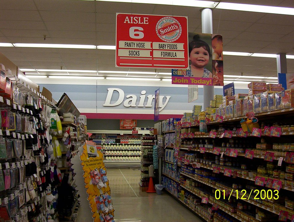
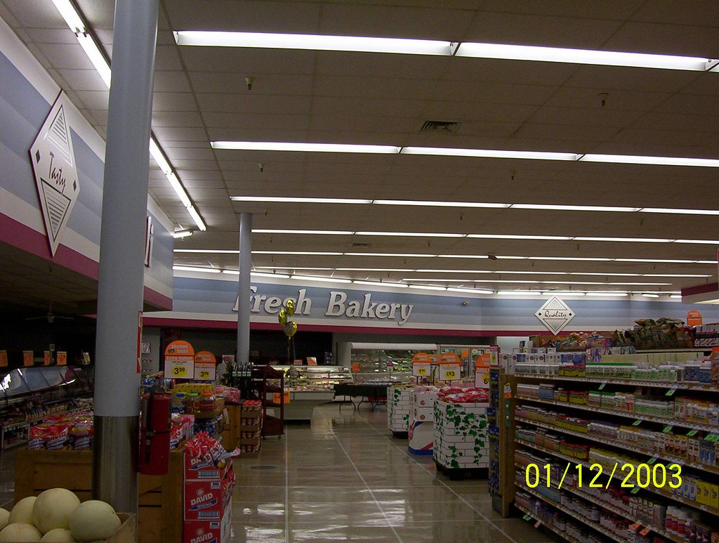
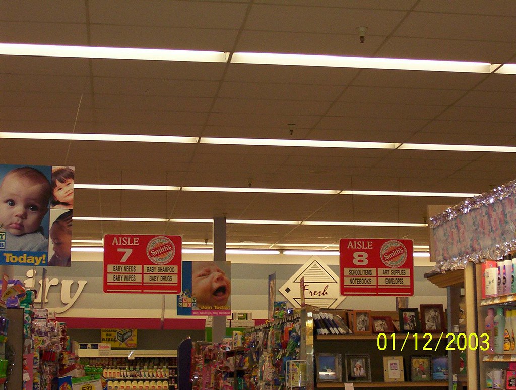
Here are a few pictures of a Smiths that opened in Reno, NV that was built in 2004. There is no other fixture that looks anything like the one over the butcher block. The store has a real floor (reminds me of the Lucky floors, but with a darker peach color spaced between the whites, this is a great store). Actually a lot of things about this design remind me of the Lucky design. Another similarity is the small writing under the departmental signs touting "convenient foods" and "usda choice" and such. Or maybe
it is time for me to go to Rocklin.
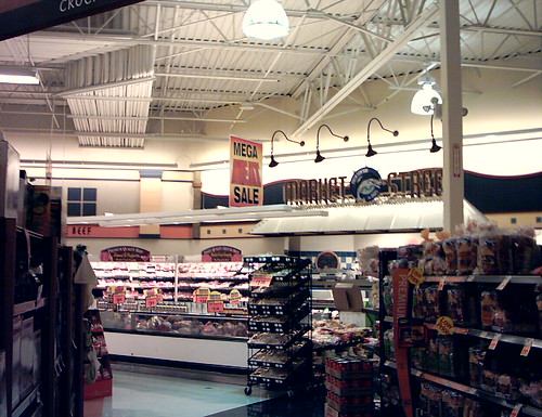
Here is one from a store that opened in I think 2003, or maybe even 2002, also in Reno. (Smiths only has two stores in Reno; the 2004 store was a replacement although the store it replaced was about six miles away).
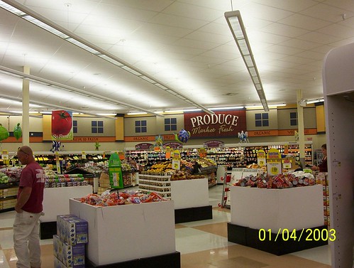
I have some from a 1987 build which got a wall remodel and some used refrigeration from SoCal around 1996 or 1997 which I will post when I find them.
it is time for me to go to Rocklin.
Here is one from a store that opened in I think 2003, or maybe even 2002, also in Reno. (Smiths only has two stores in Reno; the 2004 store was a replacement although the store it replaced was about six miles away).
I have some from a 1987 build which got a wall remodel and some used refrigeration from SoCal around 1996 or 1997 which I will post when I find them.
-
storewanderer
- Veteran
- Posts: 571
- Joined: 07 Nov 2005 03:24
- Location: Western United States
- Contact:
-
GreenFalcon
- Contributor
- Posts: 11
- Joined: 08 Nov 2005 04:05
- Location: Stockton, CA
- Contact:
-
storewanderer
- Veteran
- Posts: 571
- Joined: 07 Nov 2005 03:24
- Location: Western United States
- Contact:
The wall colors are sort of similar to the Elk Grove Ralphs and the new Smiths, but that's about it. The layout and design/decor elements are completely different.
Ralphs has a very light, airy, clean feel to their store. Smiths has a nice store, but it doesn't have any of those feelings. Part of that may be due to Smiths merchandising of piling stuff wherever there appears to be room and perhaps excessive use of signs throughout the store.
For instance, Ralphs has frozen foods in the middle of the store. Ralphs had a special floor pattern in that area. Smiths has frozen foods in the back corner by the dairy and the aisles go horizontal (no other aisles in the store go horizontal) and the area has the same floor as the rest of the aisles (with produce and meat/bakery/deli having different flooring). This funny placement of frozen foods makes it so the aisles with shampoo, toothpaste, lotion, school supplies, baby supplies, seasonal, and unchilled liquor are shorter than the aisles in the rest of the store.
The most obvious different (not photographed) is Smiths has one door off to the side sort of, and you enter near produce.
Another big difference is that Ralphs had an open dairy. The Smiths dairy is like a frozen case where you open a door to get to the product.
Another one is the configuration of the bakery and deli area. Smiths has no salad bar, no fancy bins for bagels, no sandwich station, etc.
Where the real similarities (I should say, direct copies) come in are between Ralphs grocery interiors and some of the Fred Meyer grocery interiors, but that is for another thread. I'm not talking elements like wall lettering but things like deli tiles, or displays...